Colour Combinations
For those who love colour, and those who aren’t sure…
Different moments in life bring feelings… some are fleeting, and some last. Colours have the same effect, they inspire different feelings, so what kind of feelings are you looking to live with? As the colours that you choose to have in your home will impact your vibe…
We have touched lightly on this before, but let’s now look a little deeper into how to combine colours that will look great together, and can be worked in different ways, to create different feelings within your home.
Here are some popular colours, combinations to compliment them, and inspirations on how to put them together depending on your comfort level with colour and how much you want, of the feeling that it brings…
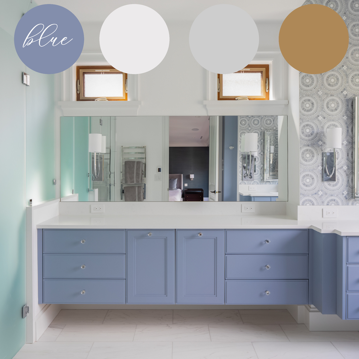
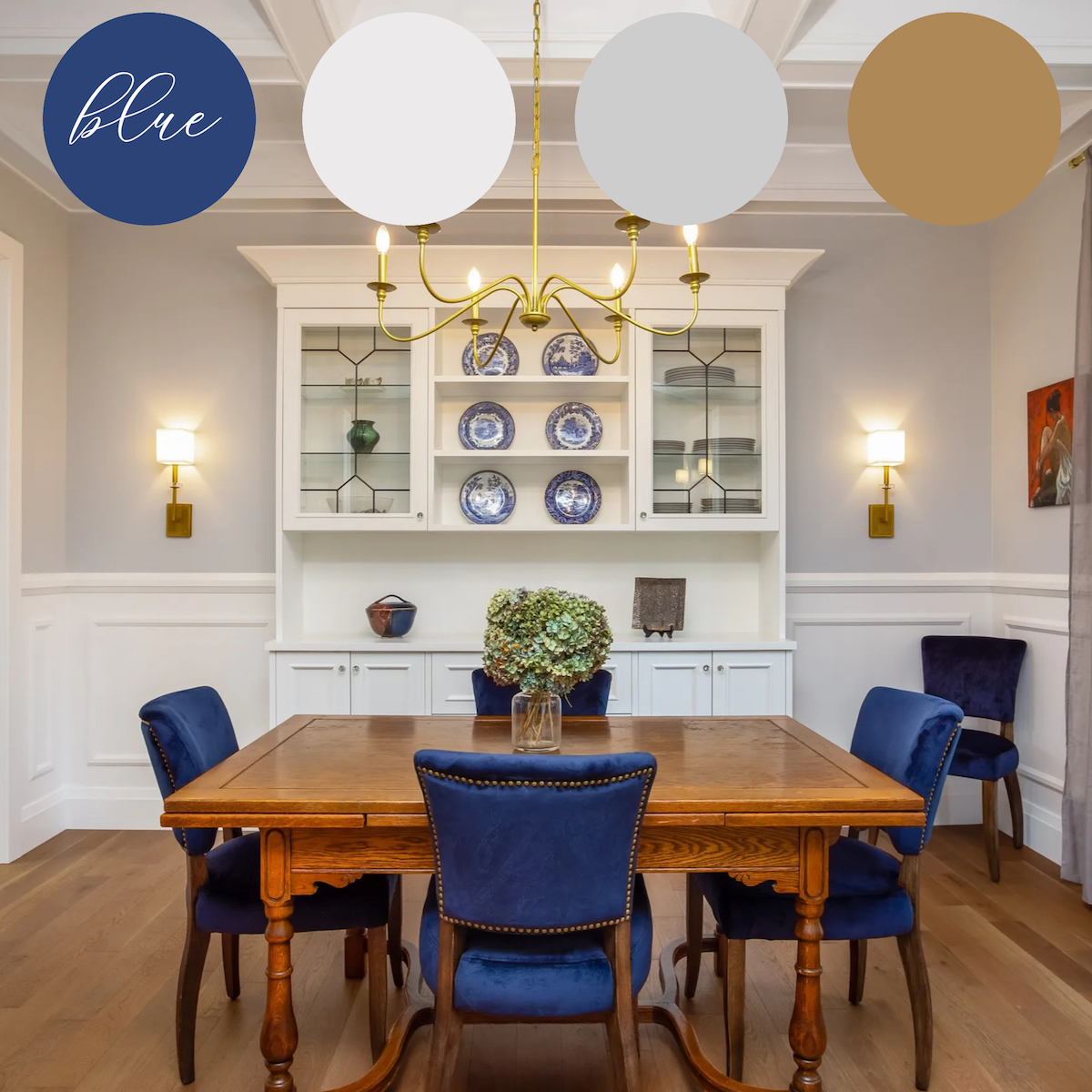
BLUE – the fresh airy ‘new-tral’ that invites CALM TIMELESSNESS
Over the past several years, the colour blue has become a neutral in the design world, a colour that we use in rather staple application along with traditional neutrals such as white, gray, and taupe, when creating the backdrops of rooms. No longer just for décor, this beautiful hue is often applied in a more permanent fashion to cabinetry, walls, and in investment furnishings. The two rooms show how a well-designed palate based on blue with white, gray, and pale wood keeps the vibe calm and timelessly sophisticated.
The ensuite bathroom isn’t shy of making a statement with its muted periwinkle millwork and artistic mosaic tile – whereas the dining room, while keeping its blue ever present and beautifully balanced, chooses a less committal way of pulling it in through the placement of heirloom china and dining chairs. Each space has a touch of pale grey and light wood to ground them.
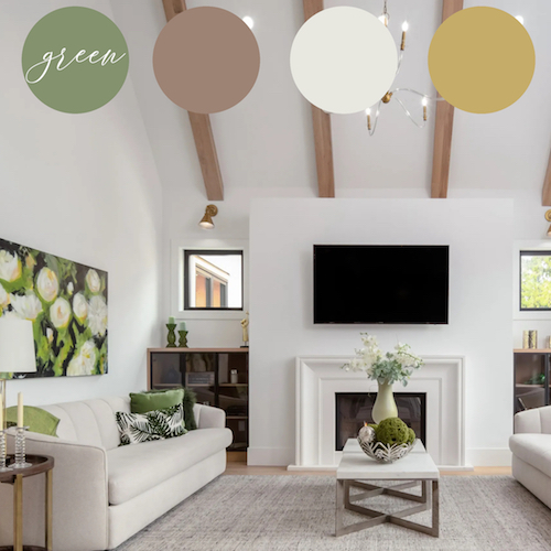
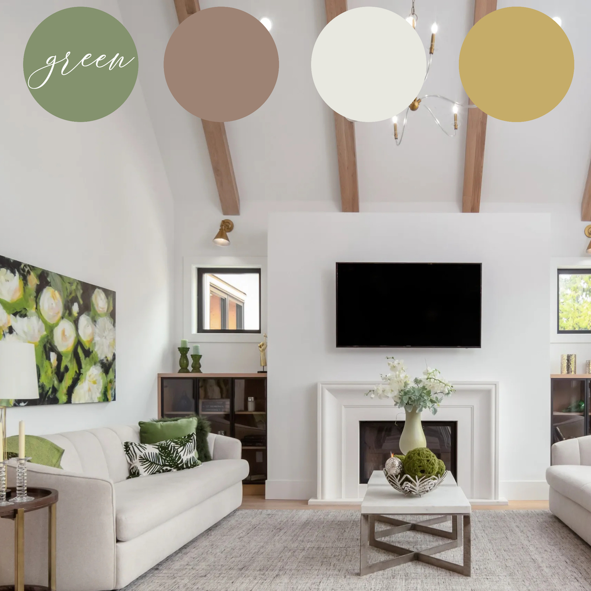
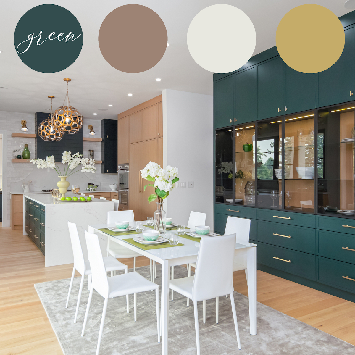
GREEN – the vintage ‘natural’ vibes of HEALTH and WELLBEING
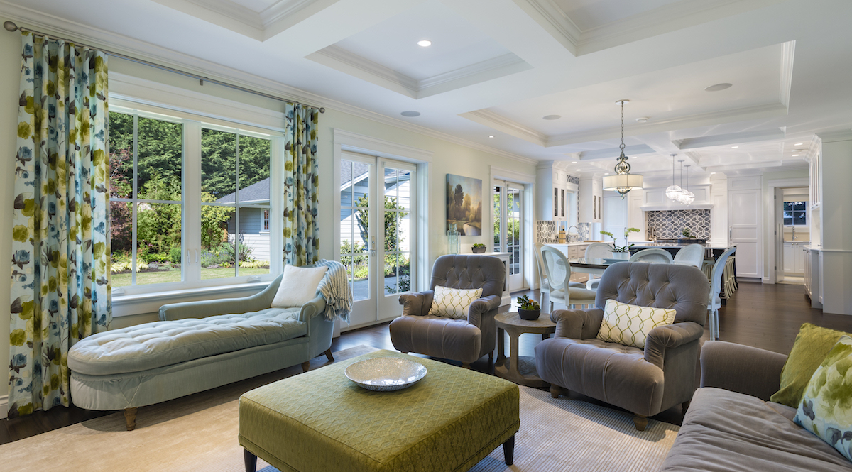
The colour green inspires feelings of a fresh healthy lifestyle. As a natural tone it can be applied with a crisp light touch, or in a deeper darker more elegant fashion that feels regal. These two spaces illustrate green paired with rustic tones of nature – clay, chalk, and bleached wood – yet with different saturations of green and different levels of permanence in their application, different feelings are created.
The living space could be altered rather easily if you were feeling fickle by simply removing the art, toss pillows, and accessories, whereas the kitchen/dining space is the result of a more assured choice to live with green for some time as it is anchored to the space in custom millwork. Both rooms have a feeling of vitality secured within them.
Greens and blues can also be paired with one another… in this example, it lends a familiar feeling heritage crafts vibe.
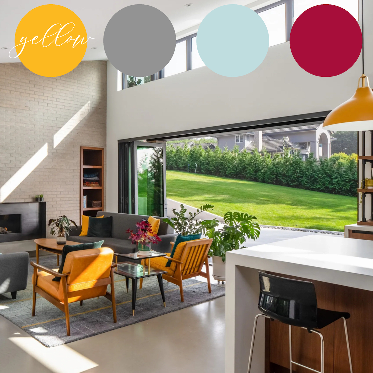
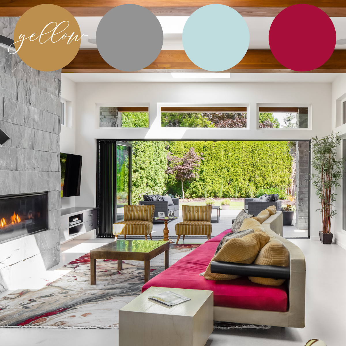
YELLOW – the spicy brightening of CHEERFUL SUNSHINE
Yellow is easily identified as one of the colours that folks are more fearful of, it playfully recalls images of picnic mustard and rubber duckies, but this would be an unfair pigeon-holing of the cheerful tone. The colour yellow, when applied tastefully – with some complimentary gray, pale blue, or red, basic to colour theory – holds the power to lift spirits by bringing a dose of sunshine indoors.
As with any colour, there are so many different tones of this primary, and as many if not more ways in which to apply it. A striking statement made by a pair of bold armchairs and iconic bell pendant light is the perfect amount of the colour to make playful the mid-century modern family house. Whereas the living space with just a few touches of mustardy warmth, might not upon first glance even register ‘yellow’ with its visitors, as the red offsets and compliments its bold contemporary statement.
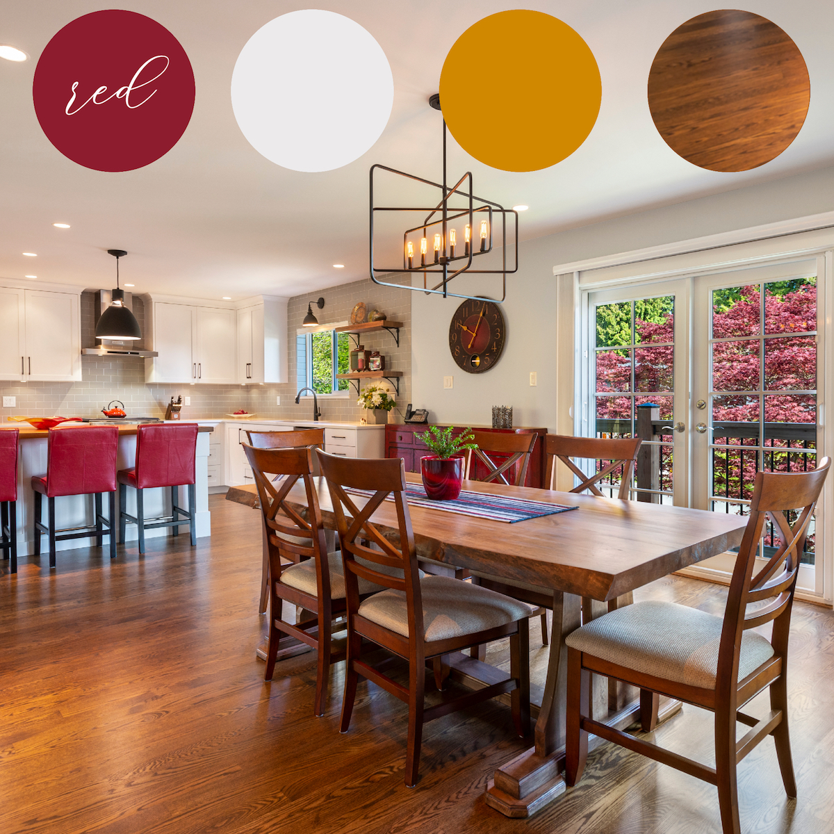
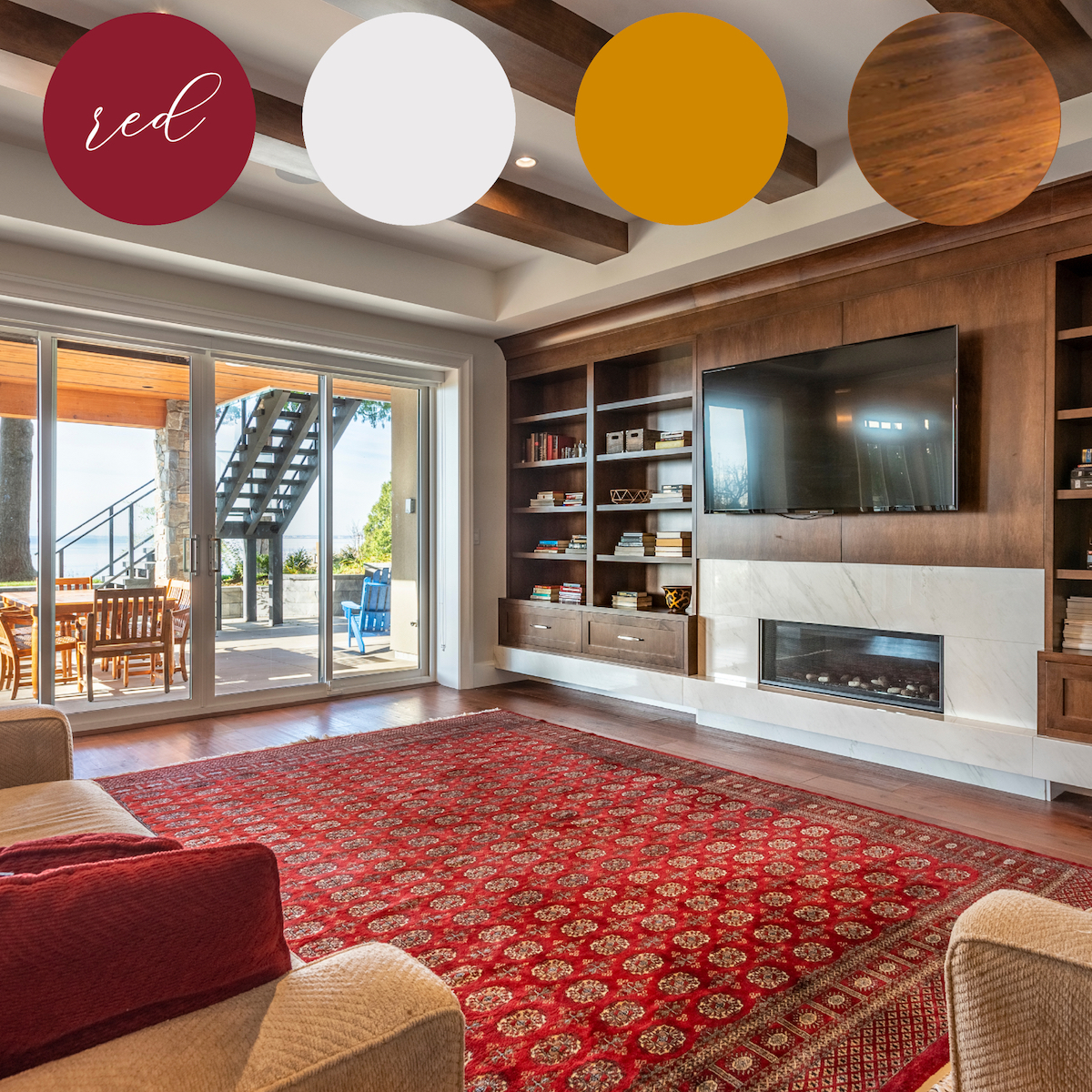
RED – the rich edgy tone that activates a COMFORTING WARMTH
Red is a colour that tends to run on trend, through periods of historic significance, or as a culturally dedicated feature. It is rich and bold, and it certainly activates something inside of us – some would call it the ‘lust for life’ – as it is tied to strong emotions, and feelings of passion. As a tool of colour psychology used to elicit hunger, it is a popular choice in accessorizing one’s kitchen. Red mixes timelessly with warm wood, gold, and white, and because of its vibrant depth it brings with it a kind of natural texture, be it metallic, woven, or glossy, to the space it fills.
These examples both utilize red in a way that allows it to saturate the space, without being overbearing or intimidatingly permanent. Many people are afraid to apply red paint, and these spaces show that you don’t have to stain a tray and roller in order to bring this colour into your life… and should over time your passion fade… white, gold, and warm wood in more permanent backdrop application will go well with most other colours too! ????
Any colour scheme can range from a little to a lot – depending on how much of each hue you choose to use ???? so if you are shy of colour, pick a scheme that you like, and apply more of the neutrals with just small pops of the colour to begin… perhaps in your art and accessories… and then you can integrate more colour into larger, substantial, and permanent applications, as you become increasingly comfortable and confident with your choices.
Tags: colour, decor, furniture, interior design, planning, style